Mood, Look, Feel
In today's blog I am discussing mood boards! I really love a good mood board - they are beautiful and fun to look at, they can inspire, excite, and allow one to escape reality for a moment and fall deeply into the story that is being told through the mood board. I don’t think I’ve ever given a presentation where someone wasn't excited to see what's on my mood board and hear what I had to say (or at least they didn’t look like they were). I'll give you insight into what a mood board is, what my preferred type of mood board is for an interior design project, and how to use it in the design process through to the end.
So what is a mood board? A mood board is a tool that designers create to communicate the overall feel / design direction of a project to the client or end user. It is useful because, oftentimes, what goes on in the head of a designer is not easily understood through words or explanations.
Mood boards are practical tools to communicate the designer’s intent for a space before creating precise schematics and/or 3D renders. Mood boards may include color, design, textures, details, ideas, etc. to convey the aesthetic direction proposed and to give visual content to support the feeling, style, or look designers are trying to portray. Think of it as a board that captures ideas the designer has for the space, which the designer has developed leveraging their experience and research.
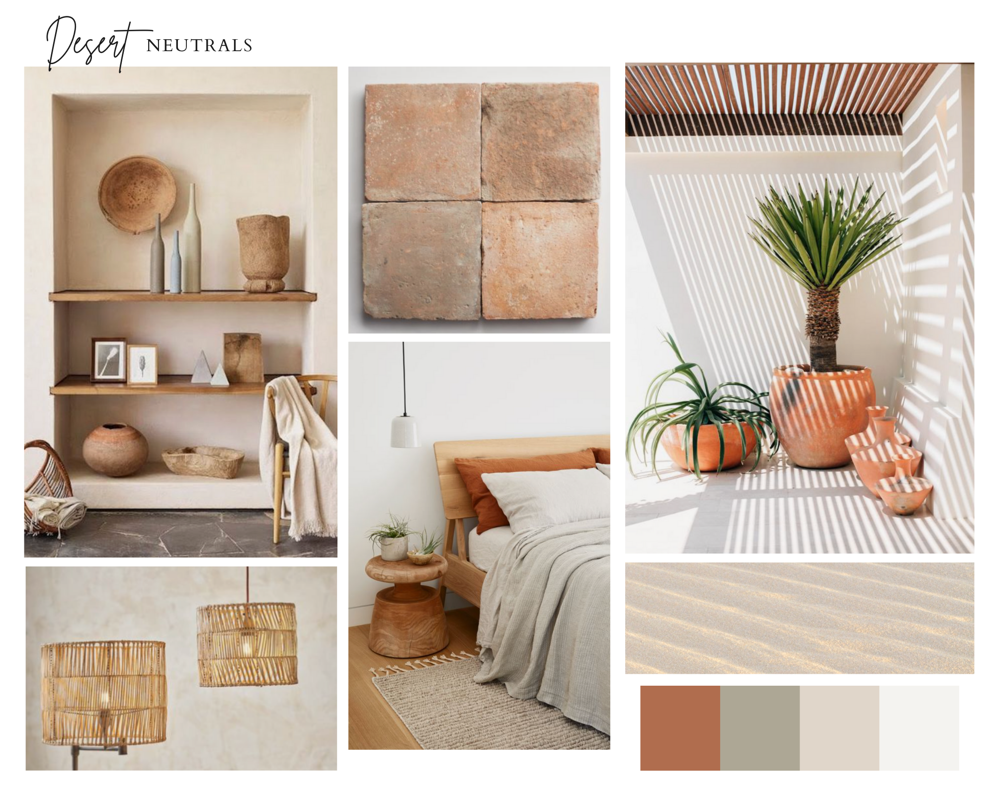
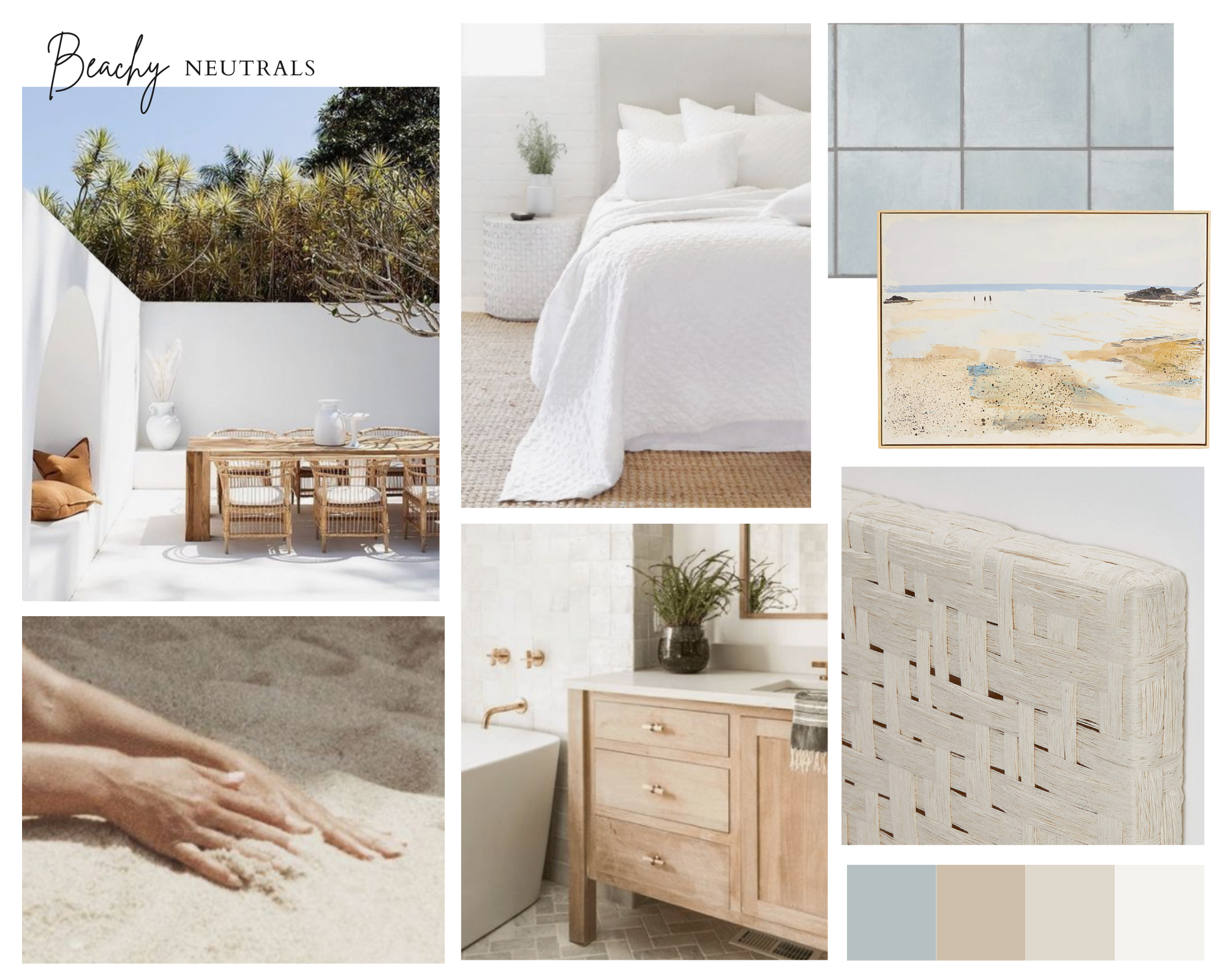
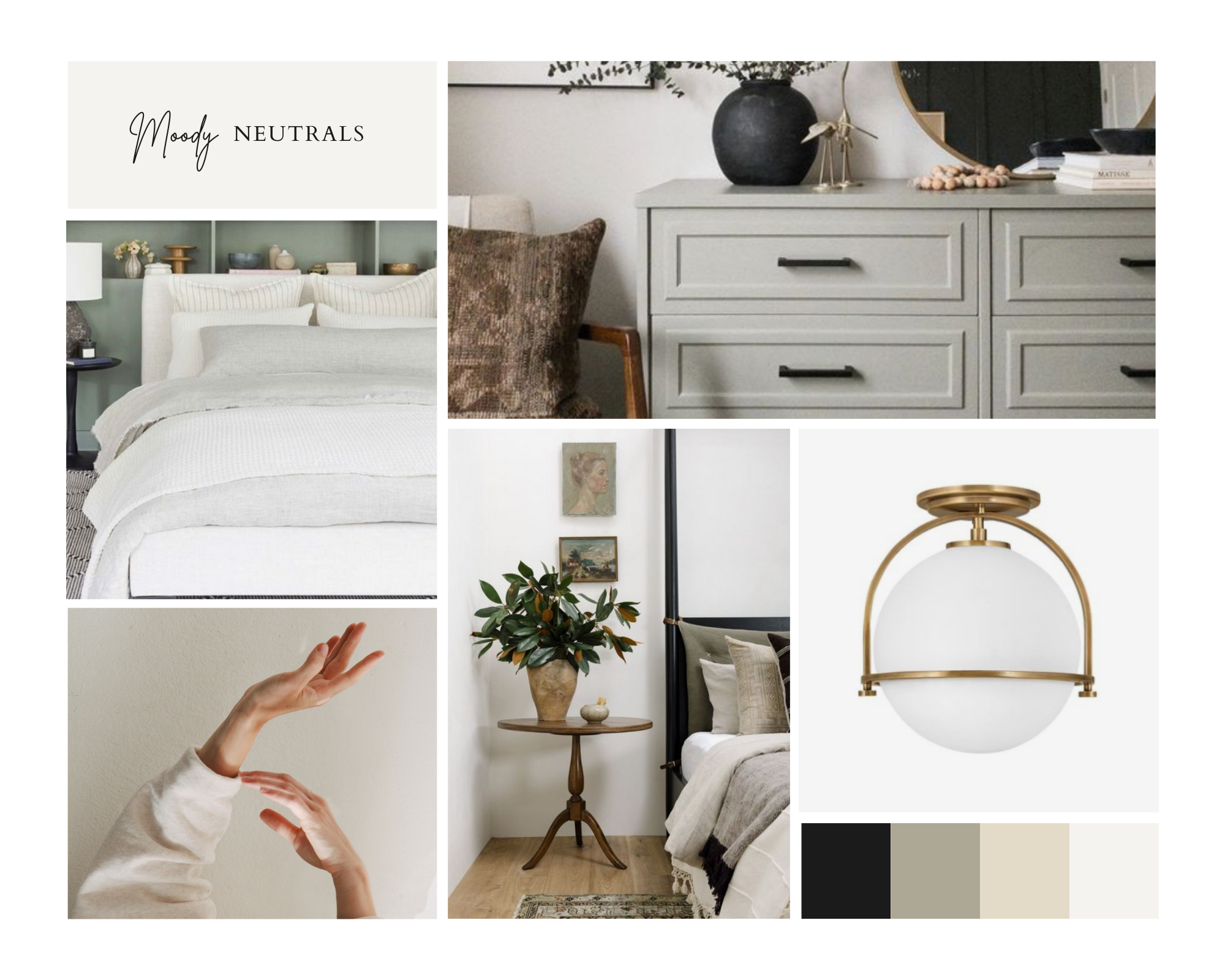
Mood boards come in all shapes and sizes. Some are physical and may include swatches, color cards, and other physical materials alongside inspiration pictures. Others are digital and are composed of one or multiple electronic files that are shared with the client. And there’s yet some that are a mixture of both physical and digital boards. It really depends on the designer and how they feel is best to communicate the design intent.
In my case, I love physical mood boards. I love to touch and feel things. I find that thoughts and intentions are best communicated with samples alongside a beautiful printed mood board. Perhaps since I’m a creative at heart, the thought of working with something beautiful makes the idea of creating or studying physical mood boards so fun and exciting for me.
Despite my preference for physical mood boards, I want to touch on the most common type of mood board nowadays, which is a digital mood board. Digital mood boards require a different approach from the designer perspective, and may also be highly efficient in communicating one’s thoughts. They also allow for use of other types of creative elements aside from imagery, sketches, static renders, and physical samples. It is not uncommon for designers to attach animations or short clips to a digital board, which may be excellent ways to convey a feeling or share a scene for inspiration.
Bottom line, there really is no right or wrong way of creating a mood board, and it really depends on your and the designer’s preferences.
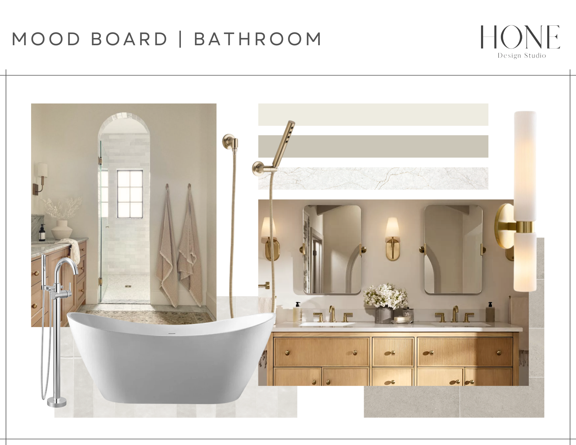
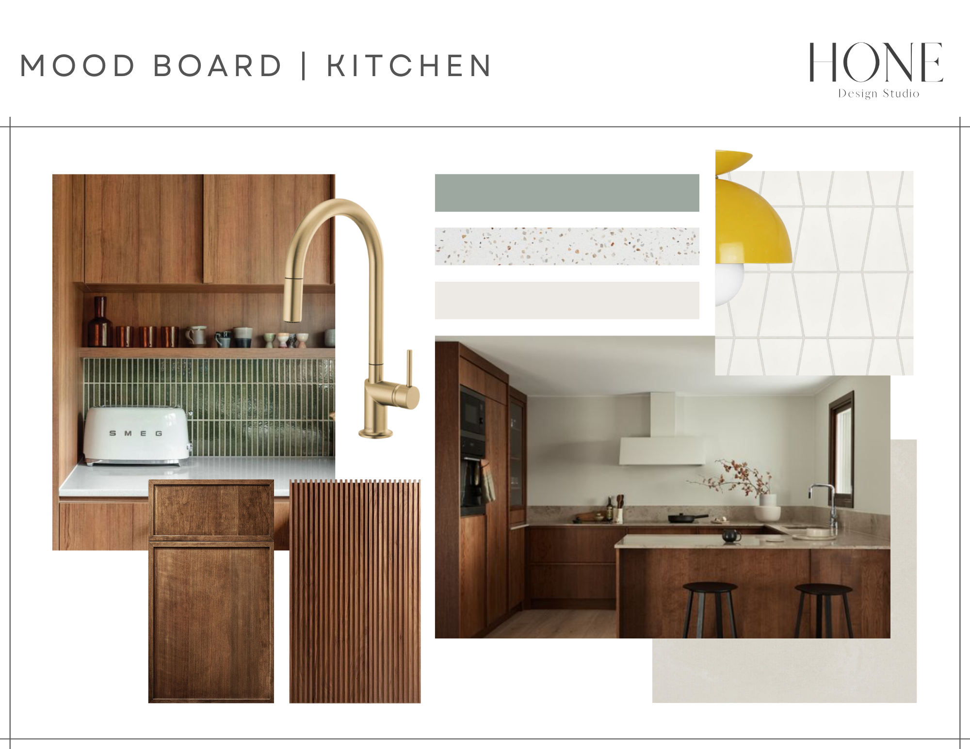
Finally, how should you use a mood board throughout a design project? A mood board should help you accomplish three key goals in your project:
Visualize the designer’s intent for a space for you to provide feedback on
In the first stages of a project, the intent of mood boards are to serve as work-in-progress illustrations of what a proposed design intent looks like, and to gather feedback from the client so the final version fully aligns with the client’s vision for the space. You will want to make sure you voice your genuine opinion about what a designer is proposing in their early mood boards, so the designer may adjust. Remember, mood boards are meant to be communication tools. I find that the more candid the early feedback on my projects, the smoother the later stages of the project go to accomplish a design that the clients absolutely love.
Set the design intent for the project
Once client feedback has been incorporated into the mood board, the final version of the mood board serves as a reference point of what the design intent for the project is. Despite of this, note that this doesn’t mean that all design elements must be included in the mood board, or that the designer will replicate layouts or purchase specific furniture or fixtures that are included in the mood board. The idea for the mood board is that the final design of the space should follow the same color theme, texture combinations, materials, and style of furnishings / fixtures / accessories.
Ensure design coherence throughout project
Mood boards are not meant to be put aside after they are created, only to be checked at the end if at all. They are meant for designer and client to keep referencing them to ensure coherence of design components throughout the project. Never be afraid to bring up any observations you have while you work with a designer, and be suspicious of working with a designer that doesn’t refer to mood boards often.
Indeed, another reason why I love a physical mood board is because it may serve as a constant reference point for me when selecting materials, furniture pieces, and starting to make decisions about design elements. It is always easier to check whether certain design elements fit in within the desired intent by being able to refer to a physical board that the designer may keep in their office rather than by referring to a digital file.
I hope this helps you become more familiarized with the concept of mood boards and how to use them when working with a designer. If you have any questions, please feel free to contact me via my contact page.
Thanks for reading my blog and until next time!
Janiece

